As a large B2C e-commerce website we take care of several Web performance metrics. First to ensure a good user experience, and secondly to have a good ranking in Search Engines Result Pages (SERP). This is a never-ending job that takes a lot of time to progress and that can be broken in a snap.
In October 2022 we introduced a new visual identity for our Brand that visually impacted all our Web sites and mobile Applications. The bad news is that it also impacted one of the Core Vitals metrics very seriously leading to a bad SEO ranking situation.
This pushes us to learn and understand more in depth the CLS metric but also the other core vitals. Here are our main lessons learnt from this Core Vitals deep dive.
What are the Core Web Vitals
Three of the various metrics used to measure the web performance are very popular and known as Core Web Vitals. These three metrics can have a big impact on the SEO ranking that is computed for the various pages of your website.
The CLS (Cumulative Layout Shift)
CLS full definition
The CLS can be summarized as the metric that measures the user screen moves during and after page load. The “and after” is very important as you will see later. To describe a “Shift”, let’s imagine your page is loading and after the first elements are displayed, a banner is included in the page top. It makes the content of the page shift to the bottom, then it is CLS.
This metric has a range of values computed on a specific scale.

The FID (First Input Delay)
FID Full definition
The FID measures the time (in milliseconds) for your web site to manage a first interaction from the user with the page. It can be a click/tap on a link or button, an interaction with a control on the page.
Here is the performance range of this metric

The LCP (Largest Contentful Paint)
LCP full definition
The LCP measures the time taken (in seconds) to render the largest visible image or Text block from your page. One thing to know is that Largest here means the size, not the weight, so a placeholder image of 1Kb can be “the Largest” compared to a “smaller sized” image weighting 100Kb.
Here is the performance range of this metric.

The percentile and devices
For each of the Core Vital metrics, Google is applying a threshold to the 75th percentile of page loads to keep a measure that will impact most users. This is an important threshold to configure in all your monitoring tools if you want to correlate your own metrics with Google ones during your analysis.
A second point that is impactful is the user device used for browsing, either mobile or desktop. Google makes a difference between desktop and mobile navigation.
Here is a dashboard we set to compare 90 percentile (on the left) and 75 percentile (on the right) thresholds both on Desktop browsers (in blue) and mobile ones (in yellow) on CLS metric.
 Comparison of 90 percentile on Left VS 75 percentile on Right for CLS metric on the same pages
As you can see, the difference between percentile and devices is very visible hence the necessity to define it clearly in your dashboards. Before this issue, we were looking at these data with 90 percentile which is not good because it can hide a change. All the graphs you will see hereafter are with 75 percentile thresholds to make the impact visible.
How do we track Core Vitals
You need to distinguish the tools that you will use to track your Core Vitals and the tools you will use to investigate and reproduce what your tracking will show you.
To track your ranking on core web vitals, you need to use a tool that will help you to get and store the metrics for all your pages. We choose Dynatrace which is already used in the company for monitoring. It provides Real User Monitoring (RUM) feature that allows us to get our real user data and a simple but efficient dashboarding tool to report on core vitals.
This tracking is done through a consent-based data collection from users’ browsers through a Dynatrace JavaScript. Once the tracking is set, you will get Core Vitals data in Dynatrace and be able to build your dashboard by selecting the metric you want to analyze and the filters to apply.
Here under you can see a simple definition of a CLS dashboard in Dynatrace to compare a first series of desktop Chrome browser to a second series of mobile Chrome browsers on the same graph.

What happened with our CLS core vital
After we launched our new visual identity, we noticed at once that the CLS metric was degraded compared to previous state on the product detail pages but stayed below the bad threshold. The other metrics and pages were good or at the same level as before. This was unfortunately a wrong understanding of the situation due to our selection of 90 percentile view by default at that time. In fact, the Product List Pages and search ones were deeply impacted when we switched to the 75 percentile view. Once we realized that, we changed all the dashboards to 75 percentile and discovered the real impact.
What surprised us was that the metrics we got through our Dynatrace dashboards were way worse than what we were reproducing with Lighthouse investigation tool or the performance tab from Chrome.
This behavior was affecting all the pages but the most impacted ones were the Search and Product Listing Pages (PLP). Here is How it looks like on our Dynatrace Dashboard for two different countries (each line is a country).
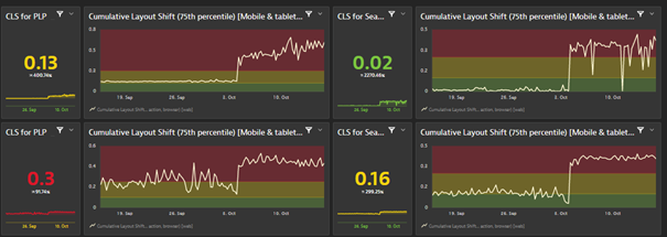
We focus here on Mobile browsers that were the most impacted by the changes. We can clearly see a bad spike starting from the deployment of our new visual identity on the 4th of October.
Given that the other core vitals were as good or even better than before we sparsely worked on it during the first two weeks to focus on other topics. But three weeks after this change, the SEO lead told us that we were dropping fast in SEO ranking on several key pages which made us come back and focus on this CLS issue.
How did we manage to understand the issue
First, we set up several dashboards with the same settings as the one used by Google, especially the 75 percentile as explained previously. This allowed us to monitor the impact of our fixing actions and view results as Google sees them.
While we were not able to reproduce the bad CLS with LightHouse and Chrome Performance tools, we contacted Google to get help from them to understand this discrepancy. This call was really very useful for us. During the discussion with Google engineer we learned and understood that CLS is not measured only at rendering time but during several seconds after the page is loaded. This was key to understand the issue. We were quite sure this was coming from our new Header given that it impacted all pages but since not able to reproduce the behavior hard to know what to change.
This tricky behavior is not captured by Lighthouse or Performance Tab, but there is another chrome tool that can help you identify it. It is located in the “More tools / Rendering” menu of Dev Tools. Once activated, it will add a Rendering entry in the console drawer where you can tick “Layout Shift Regions” and “ Core Web Vitals” to get an overlay that will display the CLS after page rendering.
Here under you can see the black panel in overlay that records the CLS during and after page loads.
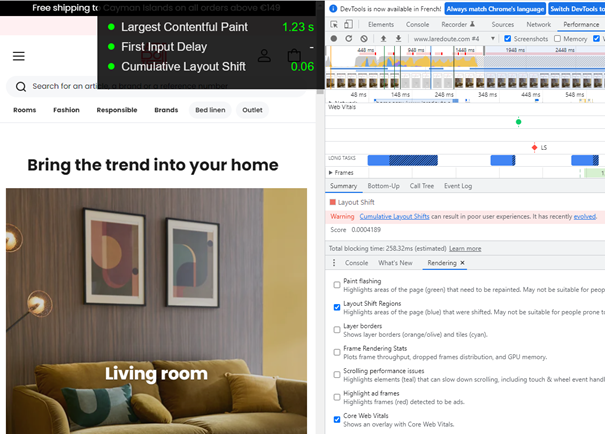
Once we activated this tool, we were able to reproduce the bad CLS metric during scroll on the pages. The reason was that our Header on scroll down, has a height change to switch from full size to a smaller sticky one on top of the page.
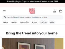
Full size Header
 Sticky one on scroll.
This explains why all the pages were impacted, but more specifically the listing and search pages where users scroll up and down much more than on product detail page.
Beyond the header, thanks to this new investigation tool, we identified that we also had an issue with our new filter bar management that was less impactful than the header one, but that we also fixed one week after the first change on header.
How did we fix it
The issue identified as been fixed by using an invisible div with the same size as the fullsize header. It is used as a buffer to avoid the content moving up when the small header is rendered to replace the full size one. Complexity is in identifying and understanding the issue rather than fixing it in this case.
What are the results
As you will see on the graphs below for the same 2 countries, these changes dramatically improved our CLS metrics.
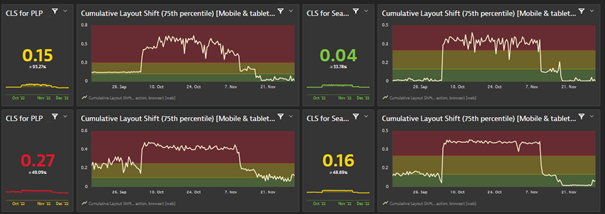
After the changes we reached an even better level than before the October rise. On the SEO side, Google is looking at the performance data within a 28 rolling days period. This means that we started to see the positive impact of our changes after 2 weeks in the Google SEO tools, and the full change after one month (by the first week of December). We have seen that the bad rating is impacting the SEO ranking much more than the “needs improvement” one.
What do we do now to detect faster
Lesson learnt from this Core Vitals alert is that we need to monitor with the proper dashboards settings on a weekly basis. This is what we do now. The “WebPerf” team reports to the different countries on a weekly basis with a newsletter. This newsletter highlights the rising trends on Core vitals (all of them) and explains to the different stakeholders the issues that we detect so that they can fix them.
This recurring communication allowed us to identify and quickly fix several animations that were impacting the CLS or LCP in some countries.
The LCP is our current challenge. It is in the green zone at the moment, but too close from the threshold, and we need to improve this. This will be another story and article.
