
Business overview
As seen on a previous article, the business process is one of 3 levels of dashboards we have. In this type of dashboard, we represent the flow between the different components that are part of the business process.
In this article, we will go through the creation of a dashboard that represents the process of collecting CI/CD metrics. While this may not be considered a business process per se, it is a process that allows us to have an overview of the system changes that support other business processes.
Step 1 – Write down your business process
To be able to create a dashboard for a business process, we first need to write it down. For that, we use diagrams.net (also known as draw.io). We have seen a similar image before, in this article
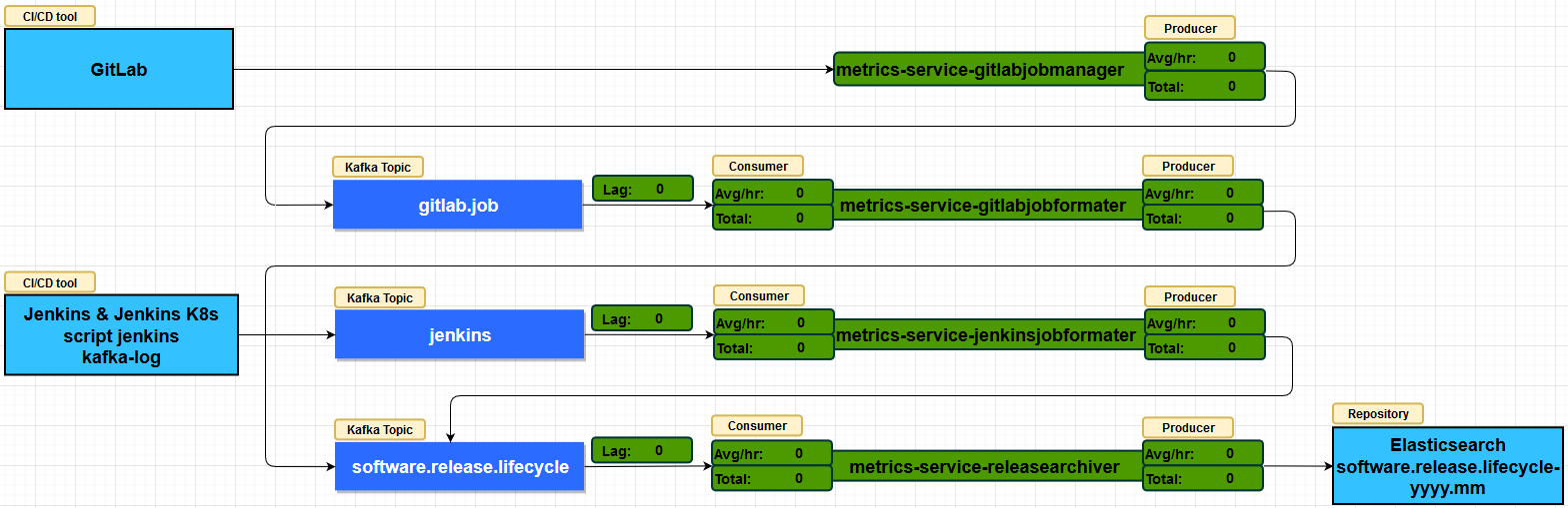
Here, we describe all the components that are part of the process to collect CI/CD metrics. So, to make it easier, we use the same format and color for each object type.
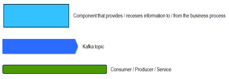
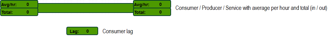
Besides that, we also include additional info to increase observability:
We finally save our drawing, to a file, to be used later.
Step 2 – Choose the metrics you want to use
We want to observe what is happening to our consumers, producers and services that are part of the flow. For that, we use the following ones:
Up
So we want to know the current status of each component. In order to do that, we use the up metric. This metric tells us if the component is currently running (>1) or if it is down (0). Example,
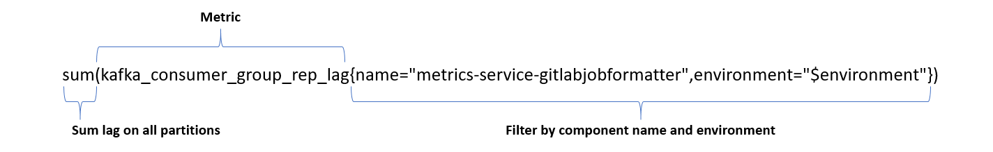
Lagging
In case of a consumer, we want to know if it is getting behind. That is to say, not handling all incoming messages as it should. When the lag is higher than zero, it usually indicates a problem that needs our attention. So, for that, we use the kafka_consumer_group_rep_lag metric. Example,
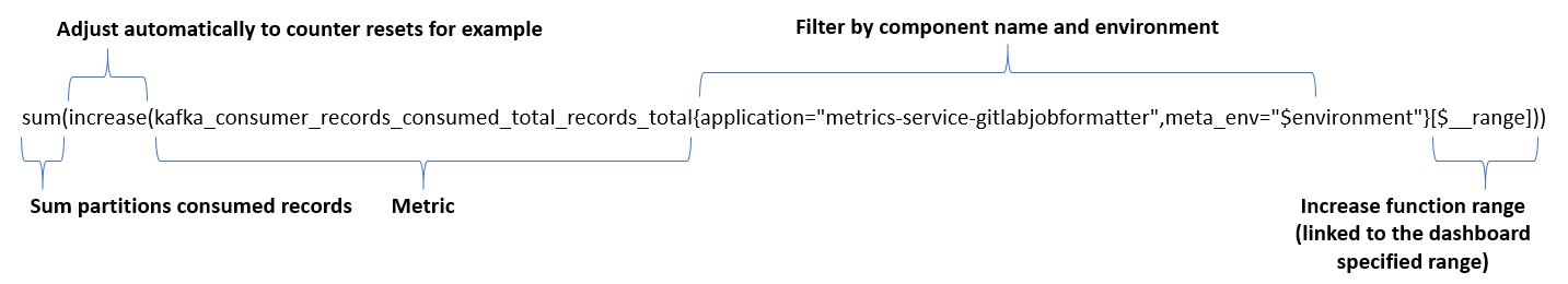
Events consumed
Also for a consumer, and besides measuring lag, we want to know the number of consumed events. Therefore, we use the kafka_consumer_records_consumed_total_records_total metric. Example,
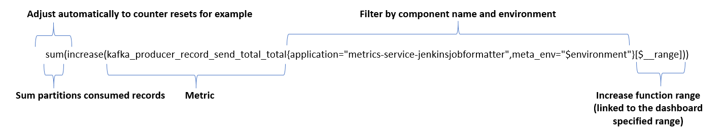
Events produced
The same way we measure the consumed events, we want to measure the events produced. In this case, we use the kafka_producer_record_send_total_total metric. Example,
Other metrics
In some cases, we may not have an existing metric we can use and will need to add custom metrics. For example, knowing the events sent to Elasticsearch. In this situation, we had to create a custom metric, which we named metrics_sent_events_total, to measure that specifically.
Step 3 – Flow Chart your business process with Grafana
We added a valuable plugin to our Grafana, which is the FlowCharting panel. As a result, we are able to use and animate the draw we made of our business process flow.
If you have read our Healthy recipe for a DevOps Dashboard (set link), you already know how to create a new dashboard. Therefore, we will now focus on how we use the FlowCharting plugin to create our business overview dashboard.
Add flow charting panel
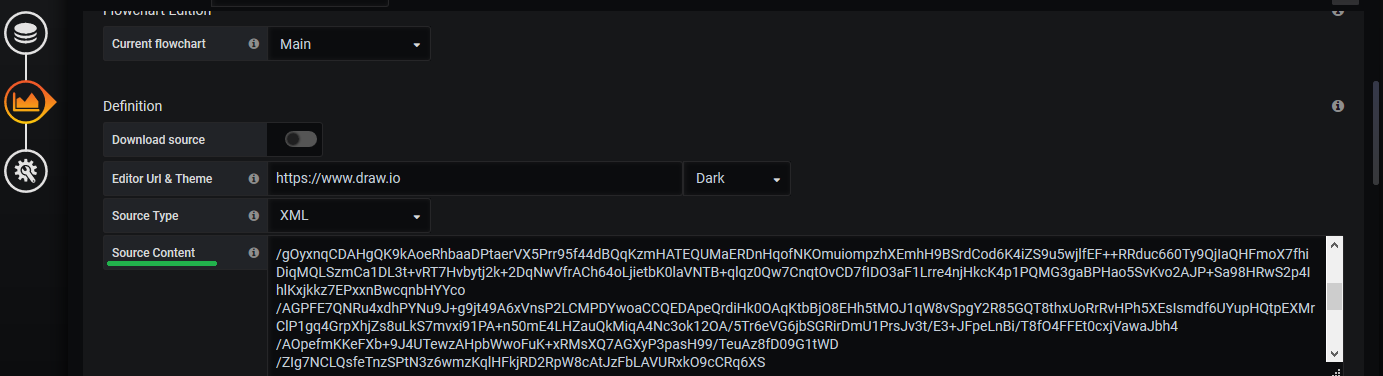
We add a panel and choose the FlowCharting one. At this point, we can immediately set the Source Content with the content we have on the business process file we saved before.
Detail your metrics
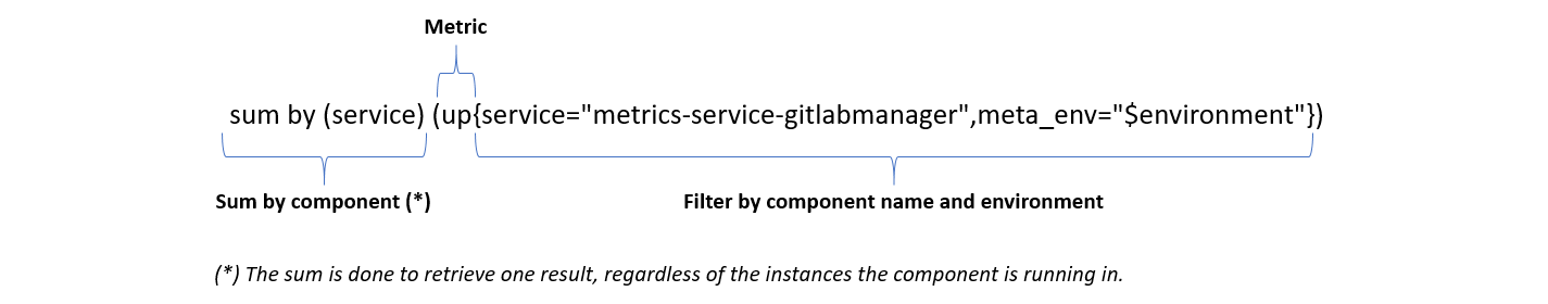
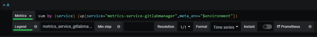
Now that we have the panel in place, we go to the Queries tab where we specify all metrics we want to use. For that, we need to specify the metric and name it for later use. For example, we want to specify the up metric. How can we do that?
We first add the query, with the up metric, we want to use on the Metrics field and then name it on the Legend field.
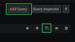
To add more queries, we can either Duplicate Query or add a new one with the Add Query button.
Name the elements in your business process flow
We have detailed our metrics and named it. However, before we can use them, we also need to name the elements on our drawing. We could keep the original elements id, but it is a lot easier if we have names we can relate to.
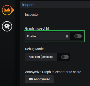
On the Visualization tab, we scroll down to the Inspect section. Here, we enable the Graph inspect Id.
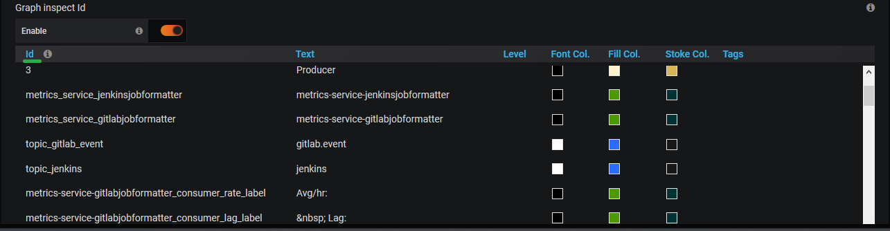
The elements on our drawing are listed just bellow and we change their ids. To make it easier, we just change the ids on the elements we want to interact with, leaving all the rest as they are. Most importantly, we try to use the same naming convention for these elements. As a result, we simplify our task to link metrics to the elements.
Describe a metric rule to add to your business process flow
Still on the Visualization tab, we need to create rules for our metrics. These rules describe how the metrics will affect the business process flow. So, to do that, we go to the Mapping section, just above the Inspect.
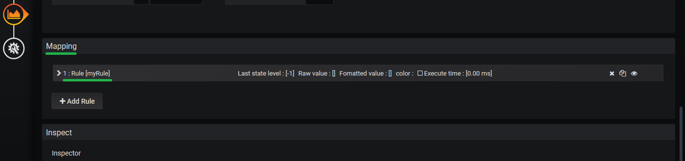
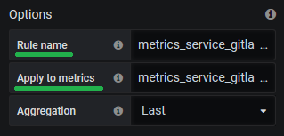
We can see that we already have a rule there we will need to change. We open the rule and see there are a lot of options we can change. On the Options we need to specify the rule name and the metric we want to use. Here, we set the Rule name to be the same as the metric legend, we defined on the Query tab, and that we want to use on the Apply to metrics field. Depending on the metric, we can change the Aggregation value. However, in this case we want to use the last value retrieved from the metric.
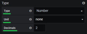
We also need to take into account the metric Type and specify it’s Type, Unit and Decimals cases we want to display.
On the Thresholds we specify how we want the elements to be displayed. For that, we specify a range of metric values and the colors to be applied.
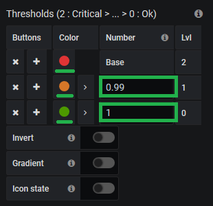
For example, we have a status metric that returns either 0 (KO) or 1 (OK). In this case, we can set red to be the base color, ignore the second, and define green as the third one with a value of 1. This means, that the element will be green as long as the metric value is equal or greater that 1. Otherwise, it will display in red.
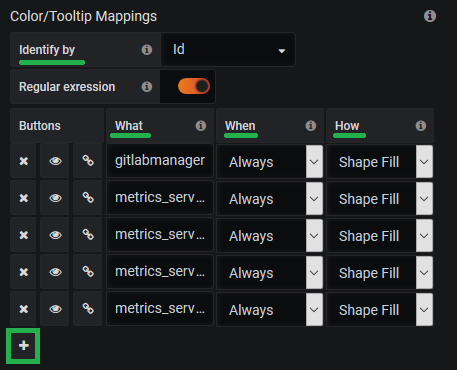
Link the elements of your business process flow with a metric
Finally, and still on the Mapping section, we specify to which elements the rule should be applied. For instance, how do we change an element color or text? For the color, we can use the Color/Tooltip Mappings option. We Identify by Id and add the element to the What, specifying the When and How it will be affected. We use the small plus sign to add all the elements we want.
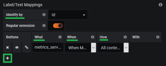
For the text, we can use the Label/Text Mappings option. We Identify by Id and add the element to the What, specifying the When and How it will be affected.
A living business process flow
We have other options to use and increase the dashboard value even more, like Link Mappings or Event/Animation Mappings. However, the ones we went through are enough to have a clear picture of how our business process is performing. We can easily visualize that a process went down or that a large number of messages arrived and caused a temporary lag. To sum up, control how our business process is behaving on the fly. In the next article, we will go through the Simplified Overview dashboard.